https://static.addtoany.com/buttons/favicon.png [ad_1]
Think of all the money you invest in attracting customers before they even get to the call-to-action … buying media or traffic, designing websites and landing pages, crafting just the right offer.
If you can squeeze just a bit higher conversion rate out of your calls-to-action (CTAs), it increases the ROI on the rest of your marketing investment.
And that’s just a few percent. What about more than doubling the conversion of that CTA? Without the need for any IT or development resources?
A recent experiment MECLABS Institute (parent research organization of MarketingSherpa) ran with a Research Partner did just that. Let’s walk through the simple word changes and what you can learn from them as you craft your own calls-to-action and button copy.
Experiment design
This experiment was a landing page test that encouraged people to get a physical copy of a textbook mailed to them. These people are decision makers. They choose a product that will lead to significant product sales from others. By getting the sample in these decision makers’ hands, they are more likely to select this product and, therefore, drive significant sales.
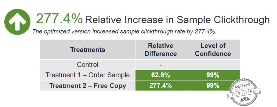
The experiment had a control and two treatments. There were several differences between the control and the treatments including changing the image, headline and call-to-action. Both treatments improved clickthrough rate (CTR), with the second treatment generating a 277% increase in CTR at a 99% level of confidence.
That clickthrough increase carried its way through the funnel to an increase for the final conversion as well — an 82% increase in conversion for Treatment 2 at a 99% level of confidence.
But here’s where it gets more interesting. While the team changed several variables between the control and the treatments, they only changed a single variable between Treatment 1 and Treatment 2 — the call-to-action — to discover the impact of the CTA wording.
“While Treatment 1 outperformed the control in both clickthrough and conversion metrics by increasing prominence, Treatment 2 trumped that by adding clarity to what the decision maker was actually getting. Going from ‘Sign In And Order A Sample’ to ‘Request A Free Copy’ created a significant lift,” said Tony Doty, Associate Director, Research and Training, MECLABS Institute.
That significant lift was a 132% increase in clickthrough for Treatment 2 over Treatment 1 at a 99% level of confidence. And while there was also a 14% increase in final conversion in Treatment 2 as compared to Treatment 1, that was only at an 80% level of confidence.
Remember, the only difference was a few words in a button. Take a look:
Treatment 1: SIGN IN AND ORDER A SAMPLE
Treatment 2: REQUEST A FREE COPY
“Small pixel changes aren’t necessarily small changes in the mind of the customer,” said Adam Lapp, Senior Director of Digital Marketing Client Services Operations, MECLABS Institute.
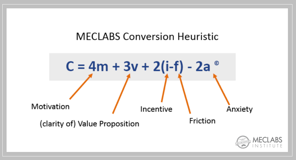
So let’s walk through why this seemingly small change had such a big impact using the MECLABS Institute Conversion Optimization Heuristic as a guide. This heuristic is a thought tool to help marketers think through important elements they can use in their optimization efforts to help improve the probability of conversion (“C” in the below image).
Motivation of the prospective customer
Where is your customer in the thought sequence when they get to your call-to-action? And what are they looking for as a next step?
Neither of these calls-to-action makes a mistake we frequently see — making too big of an ask before the prospect has seen the value.
For example, the control had two call-to-action buttons: SEE ALL BUYING OPTIONS and ADD TO CART.
Both of those go for the macro-yes too early in the thought sequence, and instead, should be going for a micro-yes.
As you can see with the call-to-action treatments that beat the control, they both have a much smaller ask of the prospect.
Value proposition
Your overall company has a primary value proposition. But there are other levels of value proposition as well. And a call-to-action button is on one of those levels.
The question you need to answer with your call-to-action is “Why should [PROSPECT A] click on this call-to-action button rather than take any other action [for example, bounce from the page]?”
So what is the value of clicking on these buttons? Well with Treatment 1, the prospect gets a “sample.” With Treatment 2, the prospect gets a “copy.” Think about the meaning of those words. Which has more implied value?
The definition of sample (according to Google) is “a small part or quantity intended to show what the whole is like” (emphasis is mine).
The definition of copy is “a single specimen of a particular book, record, or other publication or issue.”
So which has more value? A small part of something, or the entire thing?
Mind you, the actual value prospects received after clicking on either button is identical. Everyone could get a full copy of the book.
But just a change in a single word significantly changes the perceived value of the call-to-action.
Incentive
As any copywriter knows, “free” is one of those legendary “magic marketing words.”
Frankly, those lists of magic words are heavily overhyped.
However, in this case, you can see that a free copy is a much more appealing incentive to click on the call-to-action button than a sample of indeterminate cost.
Friction
Unless it’s the guestbook on the International Space Station, nobody, nobody, nobody wants to “sign in.”
You’ve got to come up with a username. And a password. And oh, wait, that password doesn’t have at least one hieroglyphic in it so it won’t be accepted. And then once you finally have come up with an accepted password, it turns out that you’ve had an account all along, but you don’t remember your password.
Now, none of this friction might actually be on the other side of a click on this CTA button — but the prospect doesn’t know that yet. All they see is the copy in the button, and the rest of the process is hidden. So this language creates perceived friction in the mind of the prospect and reduces conversion.
Anxiety
“Order” implies making a purchase more so than “request” does.
You order at a restaurant or bar, order a part, order tickets to the Jacksonville Jaguars game, or order from a catalog. All things that cost money.
However, you request information, request a song from a DJ or request a favor from a friend. All things that don’t tend to cost money.
This decision maker may not have any budget or want to use any budget simply to get an example of the product they are considering. “Order” raises more anxiety than “request” that payment is necessary when, in fact, there is no monetary cost at all.
Small changes, big results
You might overlook the copy on your CTA buttons and the wording of your calls-to-action in general. Perhaps you think, “It’s just a few words at the bottom of a webpage or in an email, what’s the difference?” But just a few minor words changes can have a significant impact, as you can see from the results of this experiment.
The famous six-word novel “For sale: baby shoes, never worn” tells an entire (in this case, heart-wrenching) story in just a few characters.
Your CTAs do as well. Make sure you’re telling the right stories for your customers, and you can have a significant impact on conversion and the ROI of your entire marketing campaign.
You might also like …
Participate in a research project and drive conversion increases (from MarketingSherpa’s parent research organization, MECLABS Institute)
Effective CTAs: How The Thought Sequence Of A Call-To-Action Affects Landing Page Performance
5 Common Call-To-Action Errors
The Most Effective Calls-To-Action
Categories: Online Marketing call-to-action optimization, landing page optimization, marketing strategy, Value Proposition
[ad_2]
source_link MMO mastermind


No comments:
Post a Comment